Launched last month, Pictorico is a free theme that combines a dynamic portfolio-style home page with a simple, single-column layout for posts and pages. It's great for pro photographers, casual photobloggers, and anyone who wants a sleek space for personal blogging.
Let's take a look at a few sites using Pictorico:

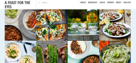
British blogger Issy shares recipes at A Feast for the Eyes, a name that perfectly captures the focus of the site: food and photography. Pictorico's front-page grid displays her mix of dishes beautifully -- her images are crisp and bold, while her plate setups are stylish and carefully considered.
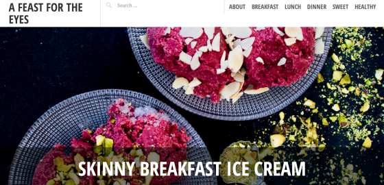
Issy sets featured images on individual posts, adding color and sophistication to the header area. She also takes advantage of the theme's clean, single-column layout, letting her images shine on the page:


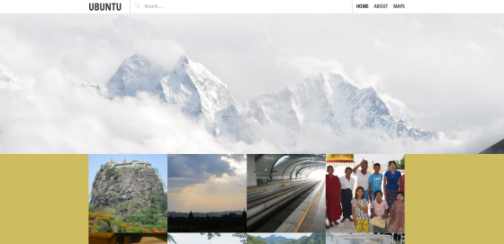
The traveler and outdoor enthusiast at Ubuntu sets a wide custom header image, which changes the homepage look of Pictorico. The panorama of snowy, jagged peaks is the first thing you see, and captures the blogger's wandering, adventurous spirit. Pictorico's custom header area accommodates images of at least 1180 pixels wide, so the visual effect is dramatic.

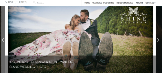
New Zealand-based photographer Blair Quax of Shine Studios uses Pictorico to publish his wedding photography, much of which captures the beauty of Waiheke Island. The front-page portfolio design of Pictorico allows Blair to showcase distinct wedding day collections at a glance. Single post layouts are elegant and uncluttered, so the focus is entirely on the couples celebrating their special days.
Blair activates the theme's post slider as well, which adds another layer to the front page:

More Pictorico examples
Visit the Pictorico page for details, other examples, and to preview or activate the theme.